Good enough design when building with AI
You've been letting go of your designs your entire career — the difference now is you can finally own what ships.
March 1, 2026
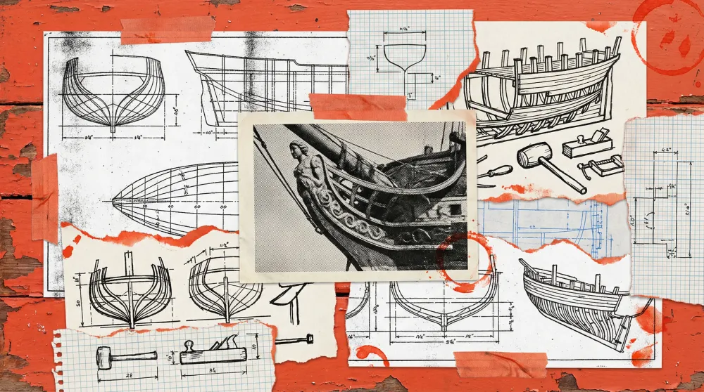
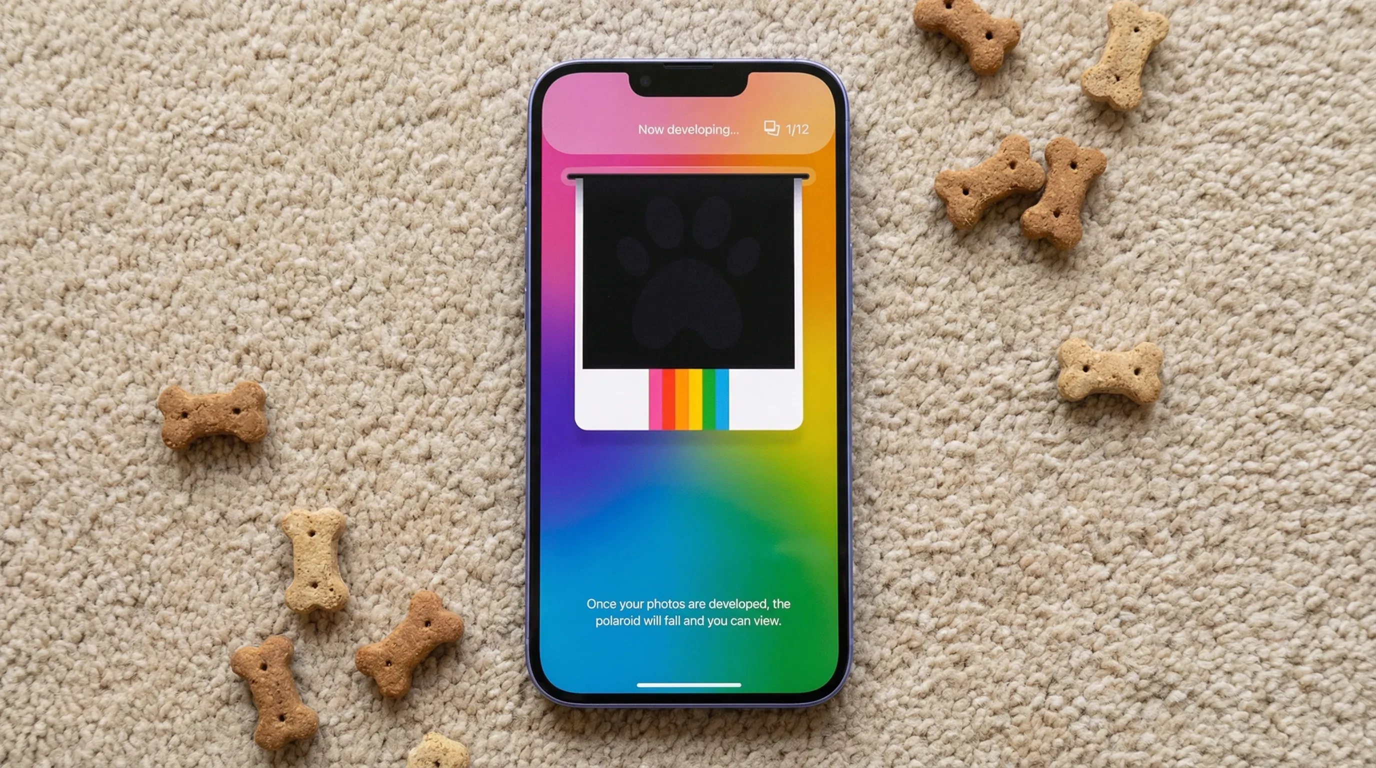
One of the first apps Josh and I built was called Pawtraits — an AI pet photo generator where you could turn your dog into a princess or your cat into a film noir star. The whole thing was designed around a Polaroid metaphor: swipe through packs, see your results develop like instant film.
I had this idea for how the generated images would load. Since the AI needed time to produce each photo, I wanted to mirror how a real Polaroid develops — the image sliding out of the camera at the top of the screen, floating down to center, fading from dark to light until it resolved into the final result. I thought it was great. I still think it was great.
We never built it.
What shipped instead was a gradient shimmer effect over the gallery thumbnails. Standard loading pattern, nothing clever. It’s still in Pawtraits today. And here’s the thing — nobody has ever once mentioned it. No user has written in to say “I wish the loading felt more like a Polaroid.” The app works. People get their pet photos. The problem is solved.
That Polaroid animation would have been delightful. It also would have cost us real time during a window when we were still figuring out whether anyone even wanted AI-generated pet portraits in the first place. We made the right call. But it took me a while to understand why it was the right call, and not just a concession.
The question that actually matters
Here’s the principle I’ve landed on after shipping seven apps in under a year: Does it solve the problem?
That’s it. That’s the quality bar. Not “is it beautiful,” not “would it win an award,” not “is this what I’d put in my portfolio.” Does it solve the problem this specific user has, in a way that’s clear and honest and doesn’t trick them into anything.
If you’re proud of the first version you ship, you probably waited too long to ship it.
I know that sounds like a platitude. It’s not. In the AI era, where someone can stand up a competing product in a weekend, the gap between “good enough to ship” and “perfect in Figma” is the gap between market share and a beautiful file nobody uses.
Where designers over-invest
I’ve been a founding designer at early-stage companies for most of my career, and I’ve watched this pattern play out dozens of times. The places where designers pour hours — sometimes days — into work that users genuinely do not care about:
App icons. I’ve seen designers do twenty or thirty versions. I’ve never heard a single user say “I didn’t download that because I didn’t like the icon.” It just doesn’t happen. If the app solves a real problem, people will jump through hoops to use it. If it doesn’t, no amount of icon polish will save it.
Micro-interactions. The design industry spent years talking about “spark joy” moments as if our job was to be Marie Kondo. It’s not. Solve the problem. Get it out. The joy comes from the thing working, not from a 200-millisecond bounce animation on a toggle switch.
Branding. At a previous company called Floor, I was part of a branding process that took three months. Two months later, the company changed its name and we did the whole thing over again. Five months of work, twice. In our current workflow, the brand process — identity, voice, differentiator — is completed in a few hours and gets shared across our AI environments for reference immediately. The output isn’t worse. It’s just not precious about how it got there.
The stuff that actually deserves your time
I don’t think design doesn’t matter. I think most designers spend their attention on the wrong parts of it.
There are really only a few moats left in product. Distribution is one. Brand is another — does your product stand out from the incumbents built for enterprise teams? And then there’s UX. Not UI, not visual polish. The actual experience of using the thing.
With Quartermaster, we have a web app that works fine. It’s clean, it does what you’d expect. But our best UX is actually using Quartermaster inside Claude Code or Claude itself, because that’s where our most valuable users already live. We spend our design energy on those flows — the one or two interactions that make the difference for our most likely user — not on making the web dashboard pixel-perfect.
In the era of AI, there are only a few design moats left. Distribution, brand, and UX — not UI.
The way I think about it: Tortuga is selling shovels and picks for builders, but we’re also building bridges for the folks who are still crossing into this new world. The web UI is the bridge — it helps non-native AI builders see what’s being built and by whom. But the picks and shovels, the experience inside Claude Code and the terminal, that’s where our most valuable users live and where product development is heading. That’s where the design attention goes.
When “good enough” actually isn’t
All of this might sound like permission to stop caring. It’s not. “Does it solve the problem?” is a ruthless filter, and sometimes the honest answer is no — and you only find out after you’ve shipped.
The clearest example from our own work was the initial beta of Ovii. Users could create an AI actor, generate scenes, produce product videos. The tool worked. The creation flow was clean. Good enough, right?
It wasn’t. Usage stalled because we’d left users staring at a blank page with a question we hadn’t helped them answer: “What type of videos should I make?” We’d solved creation but not direction. And creation without guidance, inspiration, and a sense of what actually drives action on social media — that wasn’t solving the real problem. It was solving half of it and calling it done.
Josh and I went back and built Pulse, a feature that scans top-performing videos for hashtags on TikTok related to the user’s product. Users can save those as inspiration and reference them when producing their own content. That’s the feature that made Ovii actually useful — not a shinier timeline or a smoother export flow, but the unsexy work of answering a question we hadn’t thought to ask.
“Good enough” is dangerous when it means you shipped the tool but skipped the context around it. When the problem you solved was the mechanical problem and not the human one.
What changed when AI changed the process
Here’s something I didn’t expect. I’m less precious about design now than I was before AI entered the workflow — but I feel more ownership over what ships.
That sounds contradictory. It’s not. When there was a handoff between me and an engineer, it was easy to point fingers. Every designer I know has said some version of “well, it looked right in Figma.” The implemented version never quite matched, and you could always blame the translation. That excuse is gone now.
When I see something in production that doesn’t meet my bar, it’s on me. I can jump in, create a branch, make the change, submit the PR. The distance between “I don’t like how this looks” and “okay, I fixed it” collapsed from days to minutes.
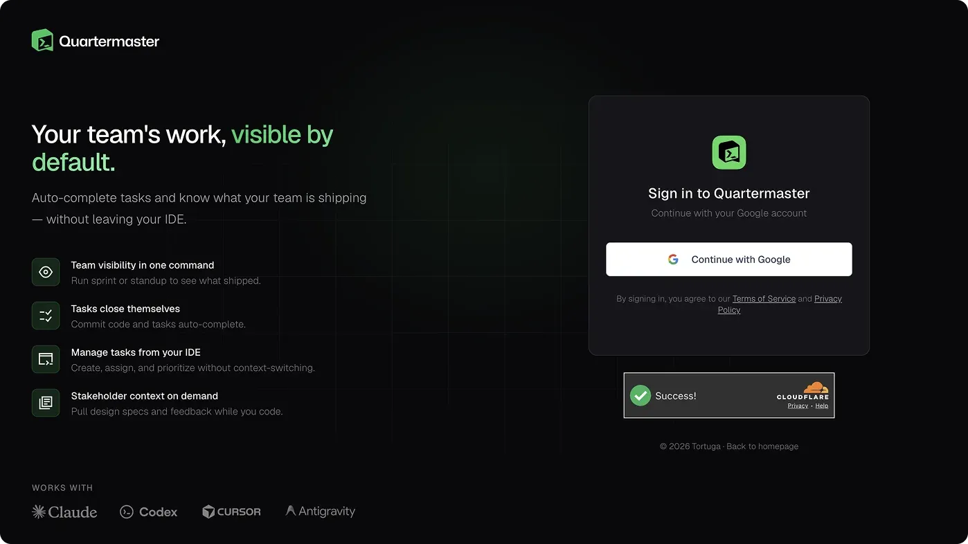
There’s a moment that captures this well. I was building the Quartermaster login page in Claude Code through the Ghostty terminal and accidentally didn’t connect the MCP. When I hit generate, instead of implementing my simple centered Google Auth design, it pulled elements from the landing page — the scrolling logo bar, feature highlights — and composed this more complete login experience with the auth on the right side. It was better than what I’d designed. I would never have spent the time to build all that out for a login page, because that’s not the moment someone decides whether to sign up. They’ve already decided. But the AI didn’t know that constraint and produced something more generous. We kept it.
What I tell designers who ask how to let go
I’ve had this conversation with a few designer friends who are trying to figure out their place in this shift. Some have watched their engineering and product partners plug into the design system and suddenly produce work that looks like theirs. Others are staring at Figma files that might never get built exactly as designed.
The practical answer isn’t inspiring. It’s just honest.
You’ve already been letting go. Your entire career. Unless you’re one of a very small number of designers who are also deeply technical — Paul Stamatiou comes to mind, shipping his own iOS apps at a level most teams can’t match — there has always been a gap between your file and what users see. There was always a handoff. The design was always translated, and something was always lost.
The difference now is that we’re being honest about it.
You’ve been letting go your entire career. The difference now is that you can actually go own the thing you’ve been letting go of.
So my advice is simple: stop mourning the control you never actually had, and go get the control that’s newly available. Cross the aisle. Learn enough about the build process that when your design doesn’t survive contact with production, you can be the one who fixes it. For the first time, the gap between “I designed this” and “I shipped this” is small enough that a designer can close it themselves.
That’s not a loss. That’s the whole point.